top of page
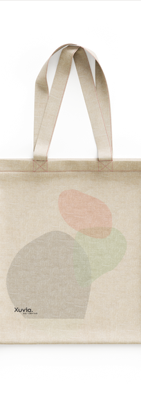
I wanted to use the natural concepts of my hub to my advantage when it came to marketing. I decided to only use the softest greens, yellows, pinks and blues - with lots of blank space. The result was clean, 'serious' but also light and communicative design which has strong connections to the natural world.
There is minimal straight lines in all of my product design - to enforce the fluidity that Xuvia stands for. Whilst I included arrows, symbols and circles throughout my website and app so everything is cohesive, I also Mae sure to keep all of my products and media as minimal and simple as possible.
pin badge:

bottom of page


